November 21, 2006
The Borg of Blue Cross

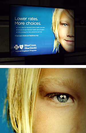
Top: Blue Cross’s backlighted sign campaign in DC’s Metro. Bottom: Detail. Click to see an enlargement of the eye.
In Washington this time of the year when friends stop you on the street to wish you “Good tidings for the season,” they don’t mean the holiday season. They mean the Open Season.
Open Season for Federal workers means it’s time to choose your health plan for the upcoming year. And the competition for our deductible dollars is fierce.
Just as the plethora of nasty political television ads end, health insurance promos begin. And on our daily subway commutes to and from work we are regaled with come-ons for this plan or that both inside the trains and at each station.
At the nexus of our subway system, Metro Center, every backlighted sign on every platform has been bought by Blue Cross/Blue Shield. Each features a different closely cropped headshot next to pertinent information. Every face is smiling and, of course, looks healthy and happy —just the way BC/BS would like us to be in 2007.
But if you look closely at each of their eyes you will notice something strange: a subtle physical abnormality? The light reflection just happens to be the cross and shield of the company’s logo.
Are these the Borg of Blue Cross? Another Photoshop contest from Worth1000? Or is this a subliminal message touting the health insurer’s brand new vision benefit? (This year Federal employees are finally getting vision and dental!)
You can be assured I’ll be looking very closely before I choose my medical provider this year.
View Most Recent Story![]() :::
:::![]() Notify me when there's a new missive!
Notify me when there's a new missive!
Comments
That’s an amazingly good pick-up, Jeff — and amazing that they did something like that! I don’t know if I find it nefarious, but definitely odd…
Posted by: Jason on November 21, 2006 9:22 PM
Wow. How big is the eye on the poster? I mean, do you think the average person sees that?
Now I’m gonna look at the eyes of every model in ads.
Posted by: Donna on November 21, 2006 9:39 PM
Jason, yes odd but probably not nefarious. A photo illustrator having some fun and successful in getting Blue Cross suits to agree.
Donna, the ads are approximately 5x3 feet. The eye was big enough for me to see it immediately as I was waiting for a train yesterday. But, then again, I’m a visual person who actually looks at these ads.
In this case I was particularly interested in the tagline: “Lower Rates.” A few days ago I went to a health fair at work to talk to the various health insurance vendors. I couldn’t believe it when the BC rep said premium costs will be less next year (I still don’t believe it).
Posted by: Jeff on November 22, 2006 8:25 AM
Comments are now closed for this post. But there are a few other entries which might provoke an opinion or two.


 ShareThis