January 13, 2008
Upgrading the DC Metro’s Identity

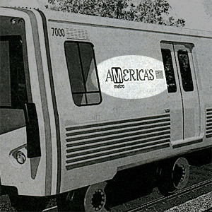
When DC’s Metro unveiled a new concept car last week this logo identity mysteriously appeared. Local officials first billed DC’s proposed transit system as “America’s” subway when it went to Congress for financial backing.
Last week the Washington Metropolitan Area Transit Authority (WMATA) unveiled designs for new subway cars that could make their appearance as early as 2013. Here in DC we’ve been debating seating designs for years. Should we continue with the traditional 2x2 seats? Or should we use more bench seating like New York City’s system, which would allow for greater passenger capacity? The debate continues. Of greater interest these days is the new higher fares when the on-time service has dramatically deteriorated.
However important these issues are, they paled by comparison when I spied a new Metro logo on the side of the new car rendering in the Washington Post. A leaner and more efficient system is one thing; an ugly logo representing it is quite another. No mention of the new identity appeared in news reports nor on the WMATA site. But even if this display was meant only for sketchy purposes, I’d like to nip this graphic in the bud. Even as a concept it’s ugly. I wince every time I look at it.
Using Metro’s present brown-boxed logo as the “M” within the word “America’s” completely undoes the unity of the text. Your eye just stops at the dark rectangle. I don’t know what font they used for the rest of the word but it’s clear its designer never meant it to be used in all caps. In addition, the font is serif while the logo’s “M” is san-serif. Mixing the two styles should be left to a professional (if at all). This logo treatment looks like a bureaucrat did it. A type treatment for DC’s subway should convey a sense of strength, reliability, and speed. It should also reflect the elegance the system’s architecture conveys. This font is too casual and lackadaisical. And it only reinforces the perception that our subway is falling apart with no clear vision of its future.
I have always been mystified with the system’s identity. The ugly brown color used on all station identity is hard to see on the pylons at street level. It’s present logo, a big and bold san-serif “M” looks uninspiring and, I might add, like the system is standing still. I understand the desire for the “M” to stand out and be seen on the street, but surely there is a font that would convey a sense of style as well. There is no sense of movement implied by this treatment. With its mechanical breakdowns, most of us Metro riders would say this indeed represents the Metro today.

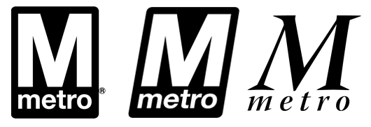
A quick comparison brings up some initial ideas. Left: Metro’s present logo (this block “M” appeared as the logo on the Adopted Regional Map in March 1968, eight years before the system opened to the public). Middle: A simple change would give the sense of movement, something DC subway’s identity desperately needs. Right: A more radical shift to a more elegant font would imbue the identity with a sense of style as well.
If nothing else, change the present “M” logo to an italic to evoke motion. But consider using a more elegant type treatment to reflect the Metro’s modernist take on the city’s Federal architecture. Bottom line: in upgrading the system’s infrastructure, don’t forget to rethink its identity. Yes, big and bold is visible, but a bit of style would make this designer a bit more proud to ride these rails and feel a lot less like I’m riding in a cattle car.
View Most Recent Story![]() :::
:::![]() Notify me when there's a new missive!
Notify me when there's a new missive!
Comments
I agree with you about the logo on the side of the proposed new car, but honestly, I like the familiarity of the old, block sign. We would all get used to a “moving” M, but I don’t feel we need it.
That logo on the side of the car is something else :-( Did you send this to Metro? Please do.
Posted by: Nina on January 13, 2008 1:31 PM
I know. When I saw the rendering I puked in my mouth seeing how they combined the logo into another word which broke all laws of typography. Last I checked the use of italic initial caps for an entire word is still a bad thing.
But sadly my final reaction was one of apathy. Living in DC you get frustrated by the bureaucracy that doesn’t value brand. It’s the nation’s capital but doesn’t seem to take seriously the image it portrays to the world. I wish they would look more outward at other great transportation systems like Berlin or London.
I agree about the brown signs. Although I think its purpose is to not look so dirty when it is dirty. I’d still like to see shiny red signs with clean white type that is consistent in size relation and justification. Like Berlin’s S-Bahn system.
And I think Metro’s current identity is still strong.
Posted by: memmott on January 15, 2008 12:38 PM
Comments are now closed for this post. But there are a few other entries which might provoke an opinion or two.


 ShareThis