April 2, 2005
Trouble Right Here in Sin City
Trouble, oh we got trouble,
Right here in River City!
With a capital “T”
That rhymes with “P”
And that stands for Pool,
That stands for pool.
We’ve surely got trouble!
Right here in River City,
Right here!
Gotta figger out a way
To keep the young ones moral after school!
Trouble, trouble, trouble, trouble, trouble…
Ya Got Trouble
from The Music Man
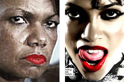
Condeleeza Rice as “Secretary of State” and Rosario Dawson as “Gail” in Sin City: Separated at Birth?
Very rarely to do I see a movie on opening day. In fact, now that I think about it this is my first in decades. Fatherhood prevents me from seeing most films above a G rating until they’re on DVD. So going to see Sin City yesterday was a very special event. It was design research of course.
The stark cinematic adaptation of three stories from Frank Miller’s graphic novels form the intertwining storyline. Reviews are in abundance so I will keep mainly to my design-oriented impressions.
Interviewed on NPR yesterday morning Robert Rodriguez, the film’s co-director (along with Miller) said his greatest challenge was to convey the look and feel of these novels on the screen:
“If you look at any black and white movie, they’re really gray and white —cause of all the colors we’re wearing now they would just go gray. And Frank didn’t use gray. He just used black and white. And, if we use all the tricks to make basically a pen and ink drawing on the screen, people will flip.”
As a designer this piqued my interest. Could Rodriguez replicate the look and feel of Miller’s books? Yes, he does. It’s not identical but he uses film to enhance Miller’s characters. The lighting is high key with very few shades of gray. You can see just enough detail in the shadow areas to give his characters a three-dimensional quality —especially their faces. Close-ups are critical to the characters’ and Miller’s story development.
The colors are primary and primal: bright reds, yellows, blues (along with the blacks and whites). However, pay close attention to Rodriguez’s and Miller’s treatment of their characters’ eyes. Very subtle color makes them riveting.
This is Mickey Rourke’s best performance to date. He’s never looked better. Tight facial shots give us the chance to really observe him (and his makeup). I remember thinking “I can see the pores on his washed up fighter’s nose.” Despite his comic book looks he is very real. After the film it suddenly struck me that Condeleeza Rice, in her updated and powerful fashionista Secretary of State guise, reminded me of Rosario Dawson’s character, Gail. I’ve been living in Washington, DC too long.
Did I say the film was violent? Majorly so. Cinematic decapitation and impalement trumps its graphic novel counterpart. Is Sin City misogynistic? Rodriguez doesn’t think so. But all the women are whores. Powerful whores, but prostitutes none-the-less. Femme-fatales —fatal women— Rodriguez says is a bedrock of the genre. Since they are playing with stylistic form, it would have been smart to play more with these stereotypical and iconic roles. Mix them up and toss them around, like we are as spectators of their work. The art direction is decidedly 21st century but the storyline is as old as history.
It’s film noir at its traditional best except that in traditional noir violence is usually implied. If you’re squeamish, the basic color palette cuts the reality closer to comic book size. But not totally. Rodriguez and Miller make up for this in shear violent volume.
I can foresee the design fallout from this film: red, blue, yellow, black, and white will begin to predominate Web design and magazine layouts —no matter the content. But when researching your next design project don’t start at sincity.com like I did. That will give you too much reality in very graphic form. The correct Web site is sincitythemovie.com.
View Most Recent Story![]() :::
:::![]() Notify me when there's a new missive!
Notify me when there's a new missive!


 ShareThis