August 9, 2004
A New Look!
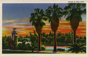
Inspired by a 1940s postcard I found at a flea market in June, I decided to remake my blog with elements of mid-century Los Angeles as well as the orchards that dotted the landscape when I was just a boy.

Echo Park, Los Angeles: the 1940s postcard
that was the inspiration for this redesign.
While the original postcard was the genesis for the new header, it needed to be reversed and then extended to complete the landscape. I photoshoped the left side, adding the rest of the palm tree, the sunset and the sky. And I drew the entire right side, fading to night with a bit of Hollywood klieg light glamour.
Many of the other visual elements came from real fruit crate labels I began to collect. I studied the type treatments of these labels and began to look for a font that, while reminiscent of the type used during that period, had a contemporary flair. The type I chose is called Fox and distributed by T26 type foundry.
I will be tweaking the design here and there over the next few weeks. I’ve still got a few ideas I am testing out. But for now, I am happy to get it up. As always I will continue to bring you “farm fresh” writing at just a fraction of the cost! Enjoy the new site.
View Most Recent Story![]() :::
:::![]() Notify me when there's a new missive!
Notify me when there's a new missive!


 ShareThis